Inside the Process of Editing a Photo Feature
A conversation with TIME magazine’s Andrew Katz about choosing 25 photos to depict climate change in America
The process of choosing one image over another, of sequencing and pairing, can assign meaning to photographs beyond the act of making them. For last week's TIME cover story, “An American Emergency,” photo editor Andrew Katz and I edited nearly 11,000 images down to a section of 25 by meeting up in person, printing out the photographs, and moving them around for hours until we were finally both happy with the result.
Adam Ferguson: The last time we worked on a feature story like this was the Australia drought story in 2018. I’d worked analog that time, and we had 700 photos that we sat down and looked through together to make a final edit of 50 selects.
On this project I worked digitally, and we had over 11,000 images to go through. Generally when I work on an assignment, I send a small edit of somewhere between 20 and 100 photos. But for this project, I walked naked and sent you large batches of between 200 and 500 photos at a time. We refined the batches as it went on.
Andrew Katz: We went into this project understanding that drought and heat were touching everything you’d be seeing out west. We wanted to paint a broad stroke of what’s happening, but we also needed to be intentional with what we were showing. If you couldn’t go back to a particular state, we had to know that you’d leave with pictures that would be able to fall into any edit we would create.
Adam: I mentioned in my post last week that I got nervous early in this assignment. That first batch of photos I sent after traveling to Nevada must have been alarming for you also because there wasn’t a lot there.
Andrew: You would tell me, “I’m not seeing it. I’ve got to move. I’ve got to pivot.” But I didn’t want to project any alarm back to you yet. You had only just arrived a few days earlier. You were also working in extreme conditions. Several of the pictures we published were photographed when it was over 100 degrees Fahrenheit—that will cloud anyone’s brain.
For you to be creative in a logistically and visually challenging environment, you might not be able to tell if what you’re doing is good. The edits you were making in real-time were broad, but there were clear nuggets in those folders. It was just too new to start thinking, “What are the final pictures here?” We didn’t know the full story yet, or what the climate would do next.
Adam: We met at the TIME building in Manhattan three weeks ago, and you had printed out 70 final selects for us to edit into a sequence for the web. When we first looked at those photos on the table, I struggled to see the sequence. I still felt close to the work, and I often need distance before seeing my own work honestly. I have to separate myself from the photographs and pretend they’re not mine.
We started sequencing for 15 or 20 minutes. I don’t think either of us spoke a lot. We just started moving pictures around. You’d put a few in place, then I would put a few in place. It was a bit of a jumble, but we started to crack the code, one picture after another.
Andrew: We had selected all the single images based on their individual strength, but we couldn’t quite nail how they would all look, and work, together. We went into the edit with one eye open, one eye closed. We knew our goal was 25 to 30 pictures, so we just had to trim the fat. What didn’t add to the story? What felt forced? What felt expected? We didn’t want any images that weren’t pushing the story forward.
The beauty of editing in person is that challenging decisions become regular conversations. Ultimately there’s going to be a decision made about each picture—whether it’s in or out—but it’s a decision that’s going to be made together. This isn’t my work, it’s yours.
I have a responsibility to deliver a compelling cutdown of this work to a broad audience, but it’s your vision and your name. Whenever possible, especially on projects where the photographer is spending extensive time in the field, I want to include their perspective when putting together a final edit. Editors start to react based on what the other person does in the room—where they’ve moved the picture—and you start to see how their eyes are seeing it.
Adam: I remember making a mess of the sequence in those first few minutes as we started sliding printouts around. I remember you saying, let’s set a beginning and an end.
Andrew: Yes, our goalposts. To give us some structure after we flailed a bit.
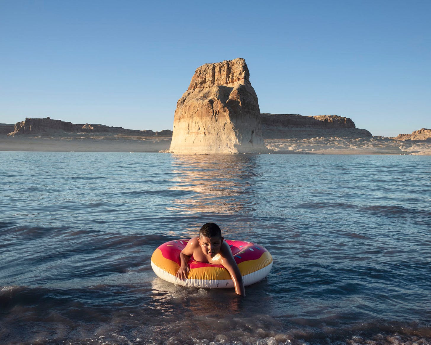
Adam: You pulled the photo of the young Navajo boy swimming in Lake Powell, which, to be honest, was probably the only photograph that made sense as an opener. I don’t think we even needed a conversation around that photo after you placed it. We both just said “yes” and “next.”
Andrew: Everything seemed to come together in that image: an epic landscape where drought is evident, the eye contact, the colors on the inflatable donut matching the land behind it. It seemed like a surreal opener for an essay that would become intense pretty quickly——a sense of normality in an abnormal time.
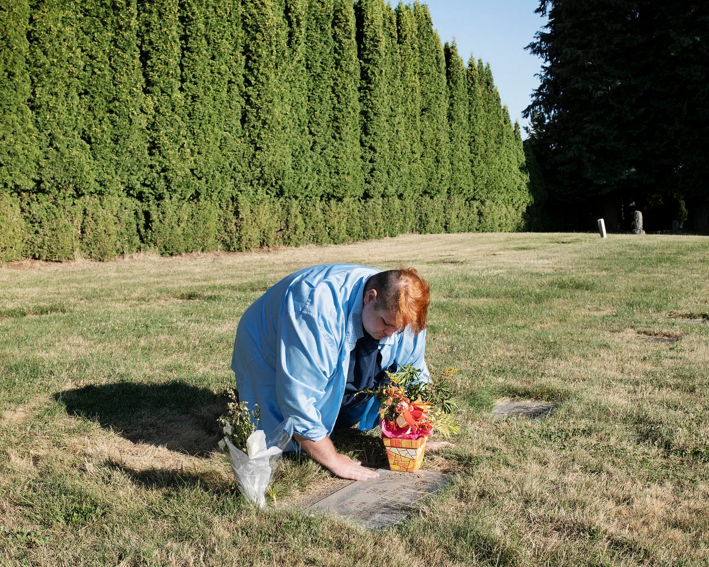
Adam: We also chose a closing photograph: Shane at his mother’s grave. I remember resisting that at the time because it felt like it was a sentimental and obvious end to me. But you pushed back.
Andrew: I felt it worked as an elegant close to the story. You went back to Oregon weeks after the historic heatwave in part to be able to include a heat-associated death from the region. I was hoping you could walk me through how you got this scene because this image is not what I was anticipating from this portrait.
Adam: I met Shane at a Starbucks and interviewed him. It was very emotional because his mother, Jollene, had recently passed. The photo needed to be intimate and explain the tragic circumstances of how his mother died.
You and I had been unsure of Shane’s participation in the story right up until a few hours before I met him. I asked Shane if he would be okay posing for a portrait at his mother’s grave, and he said yes. When we arrived, he cleaned his mother’s grave, and I started taking photographs. We were both silent. Then he stood up and I made some formal portraits of him. When we started editing, it became quickly apparent the moment of him tending to the grave was the most resonant image.
Andrew: For me, it was the gesture. With his hand on the gravestone, it felt like he was trying to be closer to her, to feel her presence. For a story that was all about loss, we needed that emotion and warmth. This is about life and death. She shouldn’t have died.
The one other thing that we did while editing was build sections within the larger edit. We had small sequences of four to six pictures that told their own stories within the entire essay. As you scroll down the web page, you have new chances to flip the script or to go in a completely different direction.
I think we took advantage of that in a really interesting way. We ended the first section with someone impacted by a heat death: Jody Marquess speaking about his late stepfather in Arizona. Then we went to the 18-year-olds on the riverfront in Portland for the start of the next section. We landed on opening with this image because it would be jarring anywhere we put it. So we leaned into it.


Andrew: People go to places where they can cool off when it’s really hot out. Their facial expressions, and their stances, and the act of shielding the sun—all of that combined felt lighter than most of the other pictures we had. But it didn’t feel any less serious.
It was also unexpected. The sun is the third character in this picture. They are lifting their hands to block the sun from their eyes while you’re photographing them. I’m just curious if they did that naturally or whether you were like, “There’s too much sun in your face. Do you want to block it?”
Adam: They were walking past and I stopped them and asked if I could take their photograph and explained the story. They agreed, stood, and did this gesture naturally, but I hadn’t set them up yet. The background was messy so I positioned them against the trees just a few meters from where we were and said, “Can you do what you just did before? Block the sun for me.” I asked them to do it as a staged portrait, but it made sense because the pose had integrity.
Whenever I make a portrait, I try to analyze the subject to find something they can do with their bodies. It always feels more authentic than asking a subject to pose in a way that has no anchor in their actions.
Let’s jump to the next picture in the sequence, which I made with the Phoenix Fire Department in Arizona. Once you had chosen the Portland teenagers photograph as the first picture of this section, I think it was apparent to both of us that the following picture would be this crazy messy scene with the firefighters in Phoenix. Although tonally it’s very bright, there is a messiness that somehow correlates to the angle of the 18-year-olds’ arms. It just felt like the next picture, and I think we both knew that.
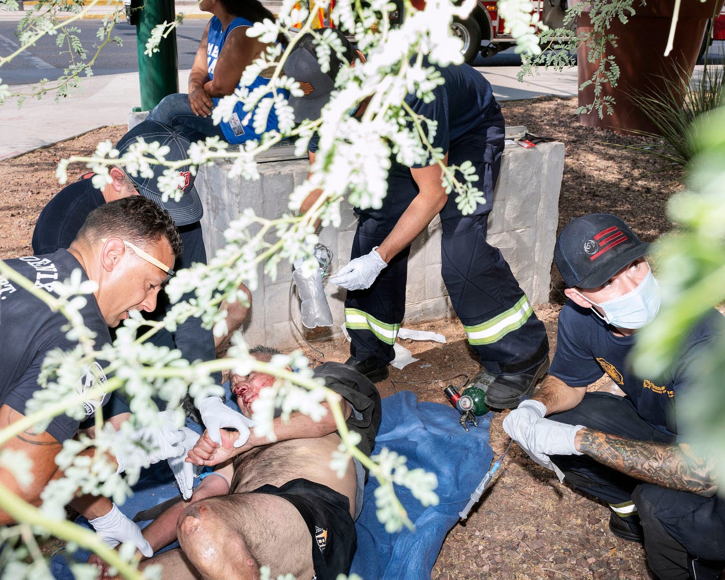
Andrew: By starting the section with a bold image completely different from everything that came before it, we needed to keep going in that direction. One of the things you told me about this scene was that the cement and the pavement are much hotter than the air when it is in the triple digits. If your skin is touching it, you’re going to get burned.
This scene captured one of those occurrences that hospitals and burn centers in the region warn people about. It’s a matter of how we show not just the reality of someone who was burned, but the care they are being provided too.
Adam: There are two really important things to consider when it comes to sequencing photos. One is the intellectual decisions around the content and how it propels the narrative you’re crafting—like moving from a heatwave to a heat injury. Then there are the aesthetic considerations: the colors, the composition, and the tonal values. I guess a successful sequence is the perfect marriage of those two things, right?
Andrew: Those are two of the toughest pictures in the entire edit. If you told me weeks before we began editing that they would end up very close to each other, I would have said probably not. It’s assumptions like this that get you in trouble when you’re first starting to edit. It’s like you need to do away with your assumptions about what this piece can and should be. You have to do it organically.
After this section, I think we started to find our groove. Things that never stuck out when they were all laid out before started to become clear.
This section also has a plot twist. There’s one switch we ended up making before publication, where we moved the image of the gentleman shooting the cattle that was stuck. We moved it from the second picture of the online essay to opposite the polar bear to take you away from people and remember this is about more than human beings.
Adam: Specific sequencing can strengthen individual photographs. Creating diptychs or pairings, or even just making a conventional move from one photo to the next, can enhance photographs through the complementary nature of their order. One image can lift another.
There's another place in our edit where I feel like this happened. That's the portrait of Jill Langham in Palm Springs and the image of the Folsom Lake Marina. Neither of these photos were among my most successful images. But when we put these two together, they suddenly became stronger.
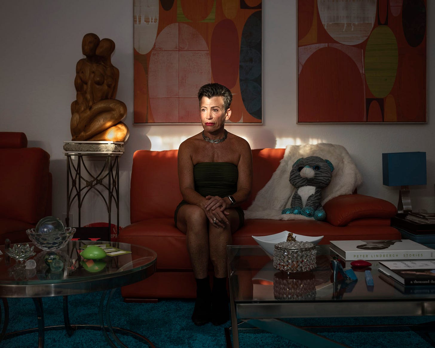
Andrew: These two images opened the last section of four pictures. In the portrait, there's natural light falling on Jill's face, and the other photo has similar colors with warm hues. They were also about two different examples of loss in the same state: One due to extreme heat and the other from extreme drought.
I think as we created that final sequence, the final pairing started to make sense to both of us. We go to irrigation worker Guillermo Gomez, and then to a barren field. There's something about the weeds in the scene from Folsom Lake, where there should obviously be water, and the cornfield where Gomez is standing. The greenery is rising from the ground in both images.
Adam: Listening to you finding these details in the photos makes me remember a mentor who once told me that editing a photo essay or a book is like making a visual poem. It’s about fusing small connections between images that are often subliminal to craft something intuitive and fluid.
Andrew: I don’t think I would’ve found the same sequence if I were doing it from my computer. Having the freedom to print images and move them around allows you to explore things in an edit that you might not have come across because your brain is moving faster than your hands or your trackpad.
This is how our photography team at TIME edits our Top 100 Photos of the Year. When we were in the office before the pandemic, we’d stare at hundreds and hundreds of pictures for hours in multiple meetings. At a certain point, when we think we have our 100, we’d print them out and lay them on the floor. We’ll then move the prints around, trusting our gut instincts, trying something we’re sure looks awful, experimenting until we pretty much get to a point where we see an intentional narrative for ourselves and the audience.
Adam: I guess the question is: Did we crack the code? Now that it’s said and done, is there anything in there where you think, “Man, we really botched that.”
Andrew: The one picture I probably wouldn’t have published was that scene of empty chairs on Lake Mead. That’s the one picture that feels out of place.
Adam: I know I fought for this image, but I also wonder if it was the right one. When I posted it on Instagram, it bombed compared to the other photos I posted. (Yes, my creative worth is pegged to an algorithm.)
Andrew: Instagram can’t be a metric of success—it’s its own beast. You fought for it, and I always want to consider the photographer in the edits we’re making, so if they feel strongly about a picture, I will try to find a place for it. I do think this image works in the sequence though because of the photo that came after it, of the portrait of Jody looking at the empty chair where his stepfather died. It didn’t feel additive enough on its own.
The other scene you captured from the boat—the photo we didn’t use of the bathtub ring up close—was very graphic. When we sent you out there, we already saw some crazy aerials of bodies of water. I felt like, if you left Nevada, that’s the picture. When you remove the boat, you have these very graphic lines across the entire image. That felt like a very moving photograph to me. It makes humanity feel very small, even though the consequences of human inaction are a lot bigger than us.
Andrew: The picture of Richard Crockett checking the level of a canal in Utah—that is a tough image to place. It’s not the most immediate read: Here is some water, it’s green, but it’s also about a drought. This was one of the few pictures we had from a state that was almost entirely in one of the top two most severe categories of drought classified by the U.S. Drought Monitor. Despite a few days with various farmers and ranchers, we didn’t have many options in Utah, so we needed perspective.
Adam: That photo was important for the story, but it didn’t necessarily work well visually.

Andrew: It was helped by the audio interview you recorded with Crockett when he says, “It’s never been this bad, there should be rain, there should be thunderstorms. We should have something, but we have nothing, and we’re going to go extinct if this doesn’t change.” To hear someone talk about this while you look at the picture was enough to keep it in.
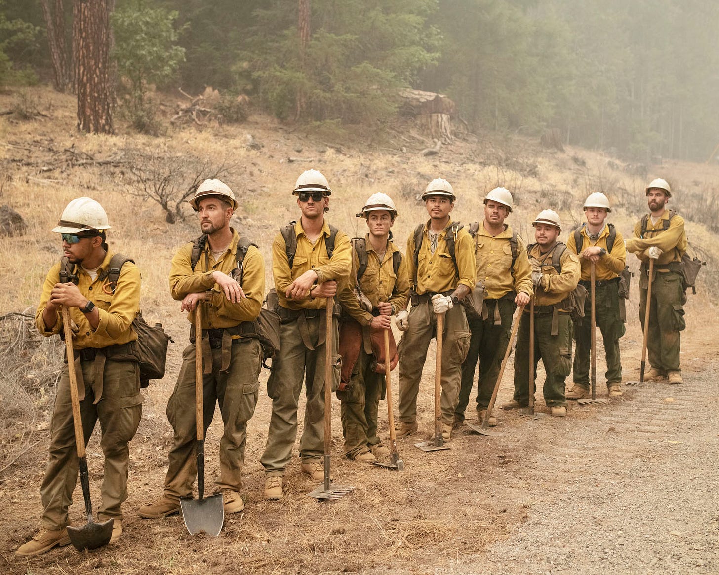
The picture that came after it, with the fire crew leaning on the tools of their trade, almost the same way that Crockett was, felt like a smart pairing—going from water to fire, having the visual cue of people performing the same actions.
Andrew: We trimmed 11,000 pictures down to 25. What are some of the images that you wish we would have included?
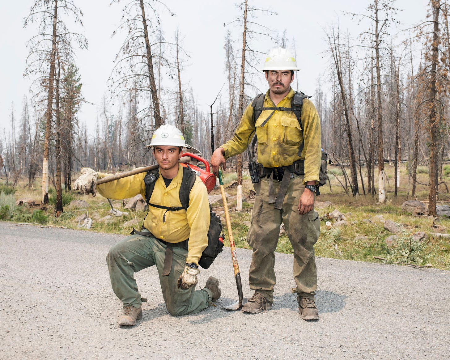
Adam: Two photos come to mind. The first is the two firefighters battling the Bootleg Fire in Oregon. That was probably the strongest firefighter portrait that I made, but it just didn’t make sense in the sequence, so we had to kill it. And that’s always a big part of editing. There are strong photos that, for one reason or another, don’t make it because they look too much like another photo or it’s a repetition of content.
On every assignment, I always make one image that I immediately feel is a worthy frame, and I think, “Oh, I just made an interesting picture.” But it turns out not to be a strong photo, even though you felt like it was in the moment as the author of it. You can get attached to what you saw and experienced.
Andrew: And then, there are pictures that you surely imagined you’d take, but you weren’t presented with those scenes, or they just didn’t happen.
Adam: I didn’t get to any dramatic wildfire flare-ups. Everything was an aftermath scene. In retrospect, given the tone of the work, I think this worked in the end because the edit is subtler. Most of what I photographed are the symptoms of climate change. If I had more time, I would dig into the causes.
I had written in my notepad to photograph the municipal trash dumps as a symbol of waste. I also wanted to photograph a meat-processing plant because meat consumption is a significant contributor to greenhouse gas emissions. But I didn’t get to it. The access was tough, especially with the pandemic. We ran out of time and resources.
Andrew: What do you hope someone takes away from this body of work?
Adam: We need to start making different decisions about how we live and what we consume as a species. We have bad habits entrenched in our society because of economic structures, and it’s hard to recalibrate and change. I hope when people look at an image like Shane at his mother’s grave, or when they look at the scene of a burned town in California, or a rancher in Utah, they realize we are on the precipice of a time that could be very desperate. It is not something that will be here in one or two hundred years. It’s happening now.




Hey Adam, Thanks for this one. An honest insight into this process was great to read. If only more editors had the time...
This is the most interesting photography-related article I’ve read in a long time. Thank you!