Recreating Hospital Lighting for a Feature about Covid-19 Treatments
A lighting plan should capture the tone and feel of a story
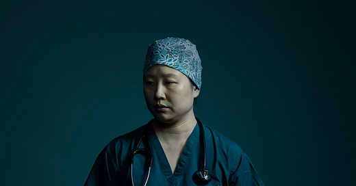
In July 2020, as Covid-19 cases abated in New York City but began to surge in regional areas throughout the country, Kathy Ryan, the director of photography at The New York Times Magazine, and Shannon Simon, a photo editor, commissioned me to make portraits for the story “The Covid Drug Wars That Pitted Doctor vs. Doctor” by Susan Dominus.
The feature chronicled the tensions between doctors who needed to quickly save patients, and researchers who were still performing trials of Covid-19 treatments. The researchers were arguing for the practice of adequate science, while doctors were making desperate attempts to save patients with medications whose efficacy was not proven.
As Kathy, Shannon, and I started bouncing around ideas, I wrote down my thoughts in an email.
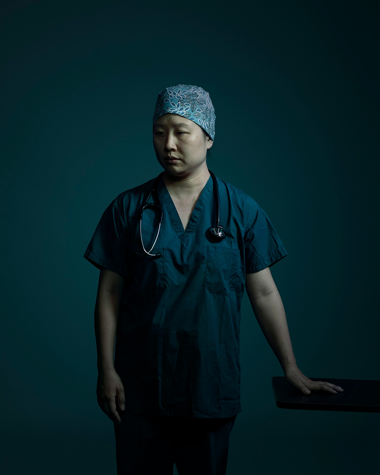
I’m thinking of portraits that convey the tension between the researchers and doctors, but also the tension and fatigue inherent to making sense of the chaotic situation by all the characters. I propose making portraits that feel quiet and contemplative, but through this stillness find a voice that resonates loudly. I’ll make a variety of compositions between tighter faces and 3/4 length on a seamless background. I’m thinking cool colors—a slate blue or desaturated green for the background. These colors in my mind fit the medical context, and are the colors my imagination goes to when I think about the virus, and death.
My premise was anchored in realism. I was photographing doctors and researchers, so I would make the lighting feel like a hospital: soft and green, like the long fluorescent tubes that line the hospital corridors and illuminate the beds. I sought a cool blue and green color palette, like in the hospitals that existed in my memory. (The color also served as a signifier for the green color of the spike protein that spreads out from the Covid-19 virus cell.) The final photographs are a bit greener than a hospital is in reality, and the light is softer than a harsh fluorescent bulb, but my creative decisions were grounded in the storytelling.
During the sittings, I asked each subject to reflect on an experience related to the story and gaze away from the camera. I occasionally intervened with a direction for the subject to tilt their head or look away from the camera. Instead of explicitly asking a subject to look tense or serious, I instead asked them about their work: the lifesaving research they were doing or a loss they’d experienced during the pandemic. As we spoke, I would see an emotional journey flicker across their faces. Then, I asked them to hold it and remember for me.
Equipment and Specs
Nikon D850 DSLR
85 mm Sigma Art Lens
Photek softlighter 46’’
2ft Octabox with extra baffle and cloth grid
Seamless - grey
Green gel
Black negative fill (black flags) (large) x 2
Roller stands x 5
Boom arm x 1
Sand bags x 6
Profoto B2 power pack x 2
Profoto B2 flash head
Profoto B1 flash head
These portraits were made with a DSLR and an 85 lens. I set my ISO to 800 because I wanted some slight digital grain and texture in my raw files. My aperture was F 6.3, which gave enough depth of field to keep my subjects in focus but let the background fall out of focus. My shutter speed was 1/200 - 1/250 which was fast enough to prevent any camera movement and also fast enough to omit the recording of any ambient light.
As you can see in the lighting set-up above, extra equipment was set-up. This is a photo of the set up for the first portrait I made for this assignment. When building the lighting technique I tested different combinations of light modifiers until I settled on the light which I used for the final photos. You can see I had a hair light with a snoot set up, but after testing it I felt the hair light made the subjects look too commercial and over lit. I also oscillated between strip and octa softboxes before deciding I liked the smaller lighting source that illuminated the face, over lighting the entire side of the subject. When working in a studio like this I often have extra equipment set-up so when I start testing on an assistant or stand-in subject, I can make quick final adjustments to the lighting and massage it into place. The best lighting plans always need final tweaks.
Key Light
The key light was a two-foot octabox with cloth grid and extra baffle. The extra baffle (additional layer of diffusion) made the octa softer than it would have been with one layer. (My former assistant Spencer Ostrander taught me this trick and its one to consider when photographing elderly women). The grid focused the light into a relatively small light source, allowing me to have an intensity of light on the subject's face while it tapered off on the rest of their body. I also clipped some cine foil over the bottom of the octa to flag the light from hitting the lower area of the subject's body.
Fill Light
My fill light was the Photek softlighter 46’’ which gave me a large soft light source to fill the space and cover the subject. On the outside of the umbrella was a sheet of green gel, making the fill light a subtle green that filled the shadows and gave the entire image a green cast.
Negative Fill
Just as important as the flash was the black flag I placed close to the shadow side of the subject. While I wanted my fill light to even out the tonal gradation through the photo, the black negative fill allowed me to cap that fill and bring down the shadow areas that were filled.
Lighting Diagram


Adam, a quick note from a keen amateur photographer but also former journalist to say I love three things about your posts: the insight into how you make your creative choices, the access to the absolutely practical elements such as why you chose a particular ISO or aperture speed, AND your terrific writing. You're not only a great photographer but an excellent writer.
Great help, thank you.